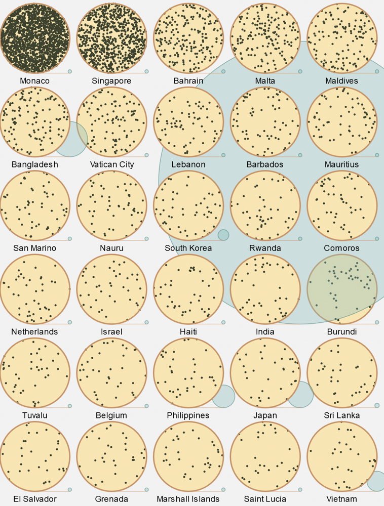
In a recent semester III Data Visualisation class, a student presented this Population Density graphic as a case study. It is a very well done piece, and I told them that it was not beyond their own abilities given that we had done a Creative coding class the previous semester.
So I took it up as a challenge to show them it could be done.
Find my coded version here.
Find the code here.
The process :
The basic population and density data was taken from a Wikipedia article, and cleaned up in a spreadsheet. The one-time sorting was also done in the spreadsheet itself, rather than implement a sort function within the code. It’s ok not to reinvent the wheel every time.
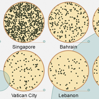
Each country is represented by 2 circles - one represents it’s population density using distributed dots within itself, while the other’s size is linked to the absolute population.
Data for each country is stored in an array. The 30-odd lines to initiate values into the array were NOT typed in by me, but generated in the spreadsheet itself and pasted into the editor. Laziness leads to innovation.
The essential logic for the density circle is that the population density number is scaled down and used to generate that many dots within the country’s circle at random positions. Since the random positions are generated using random x and y coordinates, the points that fall beyond the circle are filtered out, and also regenerated for accuracy.
I tried a polar coordinate based random generation but it clusters heavily around the centre and I changed it back to the Cartesian, but with a filter, for better-looking distribution.
The population circle is even simpler. The size of the population of each country is scaled down and used to decide the diameter of the circle. However, some basic calculations are done to align it’s base with the Density circle base. A horizontal line connects the two to give it a visual link.
A lot of tweaking was done to get the positions and alignments right, mainly because I’d made some very basic calculation and variable name gaffes that - as usual with code - took me an inordinately long time to discover.
A colour scheme was applied later to go from stark black-and-white which is my usual output to a slightly more lively appearance.
The last update I made was to include the display code within the draw() loop instead of just the setup(), resulting in a chaotically animated density visual rather than a static image.